CASE STUDY
A design system & component library for the NRCS
Context & objective
At the Natural Resources Conservation Service (NRCS), a science-based agency within the Farm Production and Conservation (FPAC) mission area of the United States Department of Agriculture (USDA), I worked on a suite of internal employee-facing legacy applications that lacked consistency, accessibility, and efficient maintenance. They were built on a web of disparate and often outdated platforms that were disconnected, disjointed, and lacked any cohesive user experience or design patterns. I led the creation and implementation of a cohesive design system and component library that improved UX quality, supported compliance, and accelerated delivery across our varied front-end stack.

Actions taken
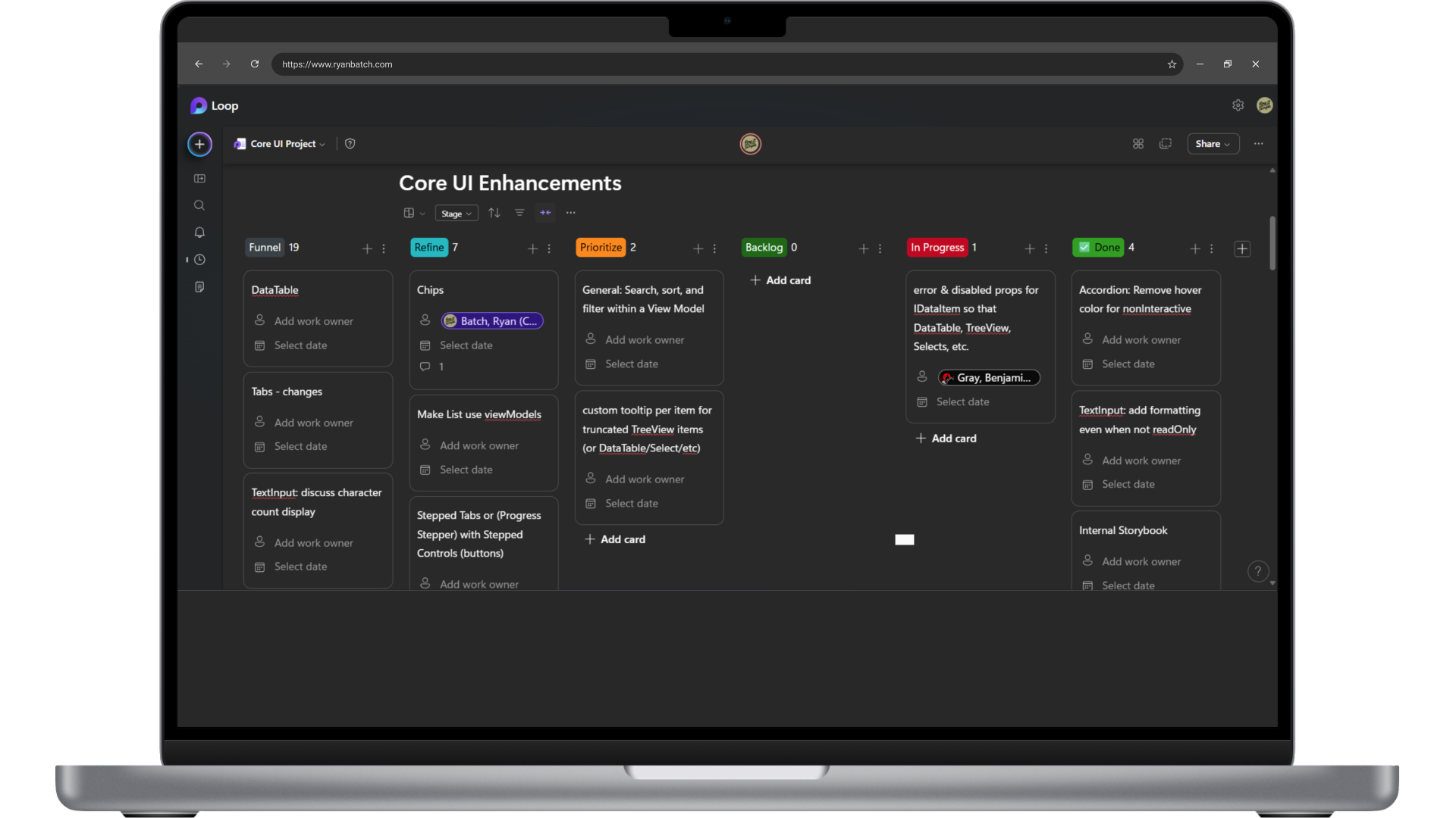
1. Built a Figma-based design system and component library
I audited existing UI patterns across our apps and built a master library in Figma, including color palettes, typography, input and navigation components, error states, and visual tokens. This system became the single source of truth for designers and product teams across multiple agile trains.

2. Created a Storybook component library in React
To bridge design and development, I collaborated closely with front end engineers to theme and develop the Figma components as reusable React components in Storybook. This effort enabled consistent, documented, and accessible reuse by engineering across the agency.

3. Facilitated cross-train UX syncs
With a growing number of agile product teams independently adopting the component library, I launched recurring “UX sync” sessions covering UX patterns, plain language writing, voice and tone, and shared component usage.

4. Integrated accessibility & plain-language governance
I organized recurring Section 508 / UX syncs to keep the component library in compliance with WCAG standards. Additionally, I hosted UX / Writing sync sessions to reinforce plain-language principles in UI copy, guiding collaborators toward clarity and accessibility in design and interface text.

5. Iterated based on feedback & usage data
I established feedback loops with designers, developers, and accessibility testers along with usage analytics and a Storybook feedback and bug reporting mechanism to prioritize component additions, or adjustments in the documentation or guidelines.
Outcomes & impact
Improved UX consistency across the entire suite of applications, reducing user confusion and supporting brand alignment.
Accelerated development efficiency by enabling engineers to reuse pre-built components reducing rework, cutting time to deployment, and decreasing defects.
Enhanced accessibility and plain-language compliance, as evidenced by 508 audits showing reduced violations, and improved user clarity with clearer copy.
Strengthened cross-functional collaboration and design maturity across trains; teams came to rely on syncs and the design system as a foundation for new features and enhancements.
Reflections
This experience highlighted the transformative value of a live design system grounded in accessibility, collaboration, and plain language. Sustaining it required not only building components but fostering shared ownership and behavioral change across UX, dev, and writing disciplines.